
Personal Brand Identity
Branding & Identity, Concept Development, Business Cards & Stationery
Branding & Identity, Concept Development, Business Cards & Stationery
CLIENT
Self—Passion Project
ROLE
Graphic Designer
OVERVIEW
Inspired by new experiences and growth as a designer, I tasked myself with rebranding my visual identity.
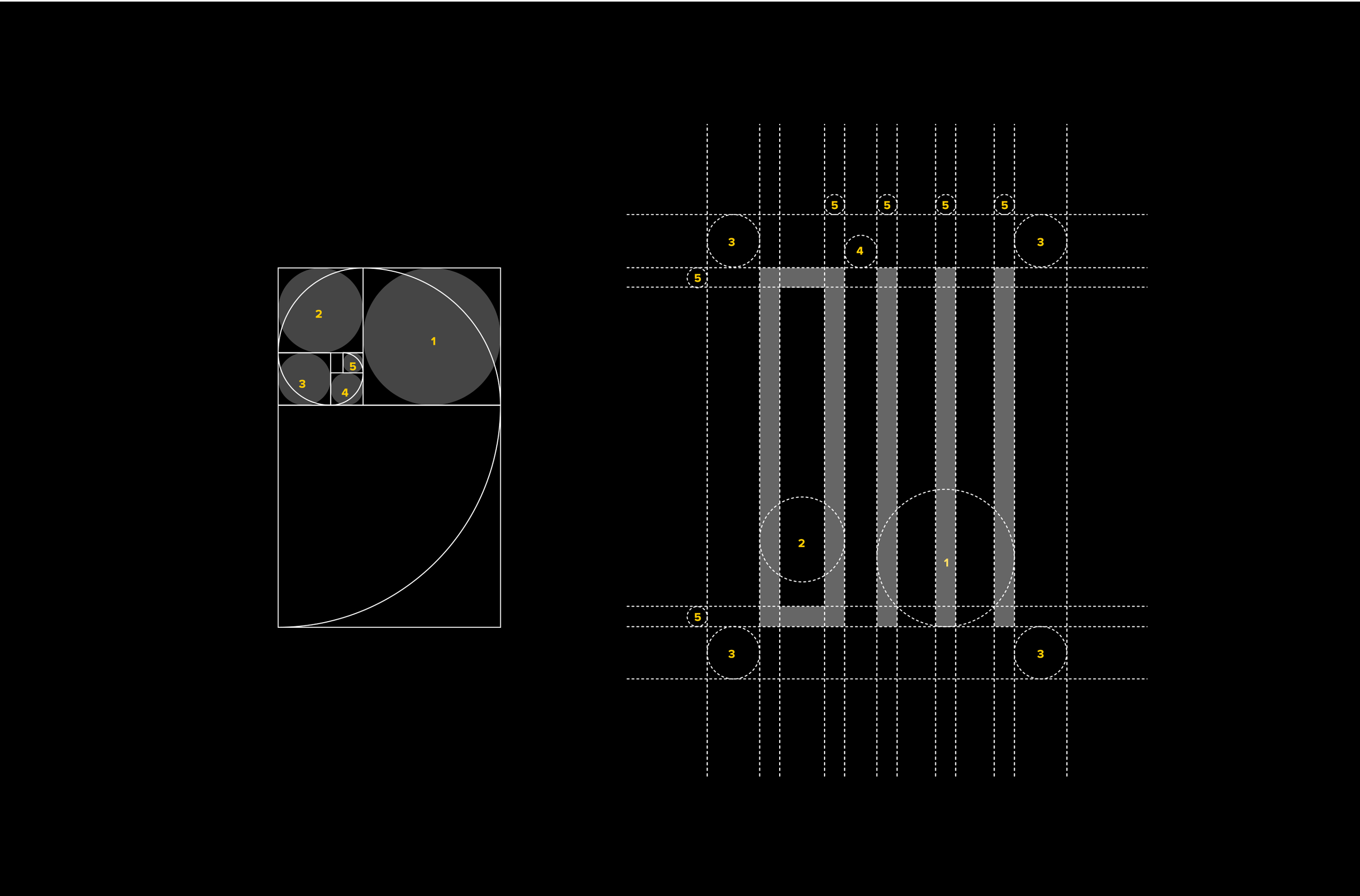
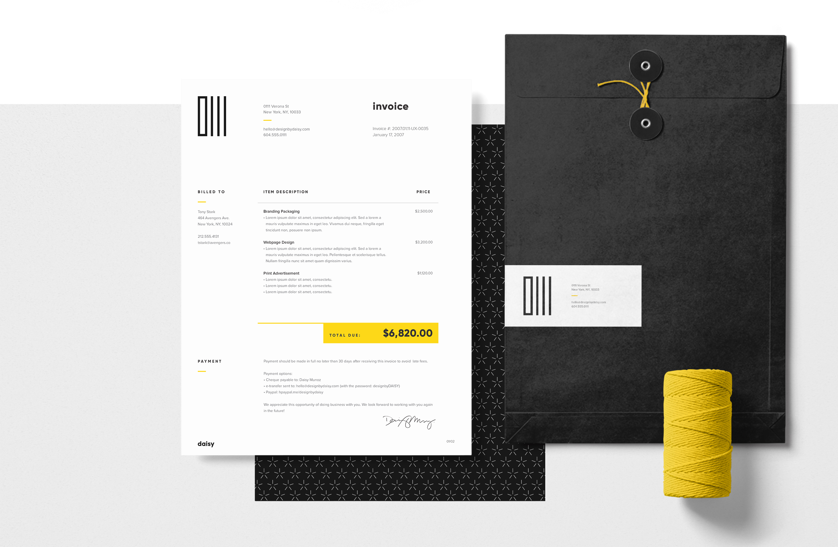
Through the concept of “Back to Basics”, the logomark & wordmark is based on the fundamentals of basic shapes & the golden ratio.
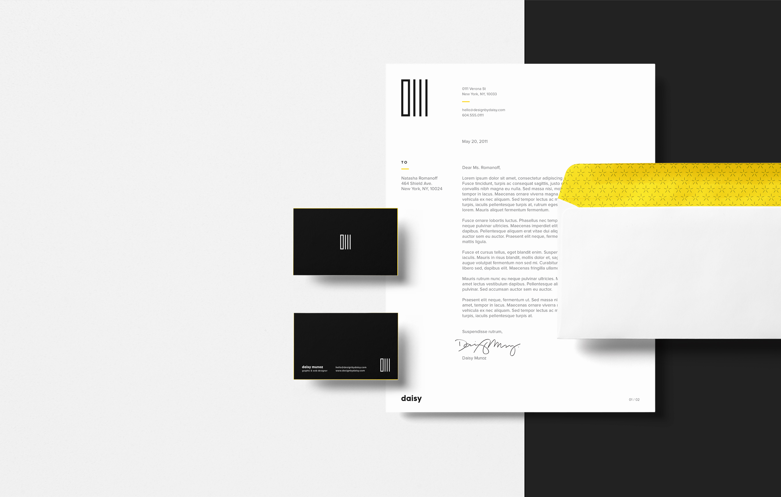
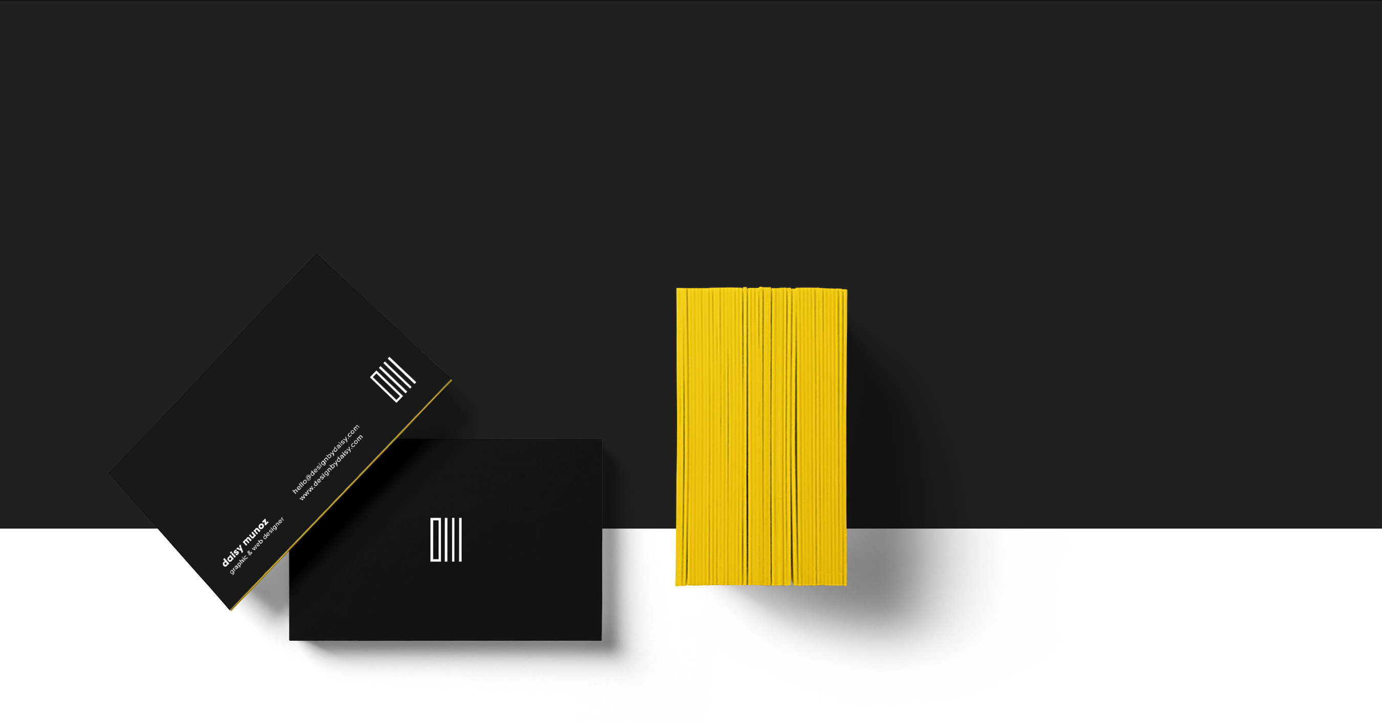
Tall, rectangular shapes showcase the “D” & “M” of my initials in its most sincere & honest form. The logomark is complemented by a bold weighted, geometric typeface to showcase the simplicity of each letterform with the purpose of expressing objectiveness & strength.
Read the full case study.


© 2024 Design by Daisy.